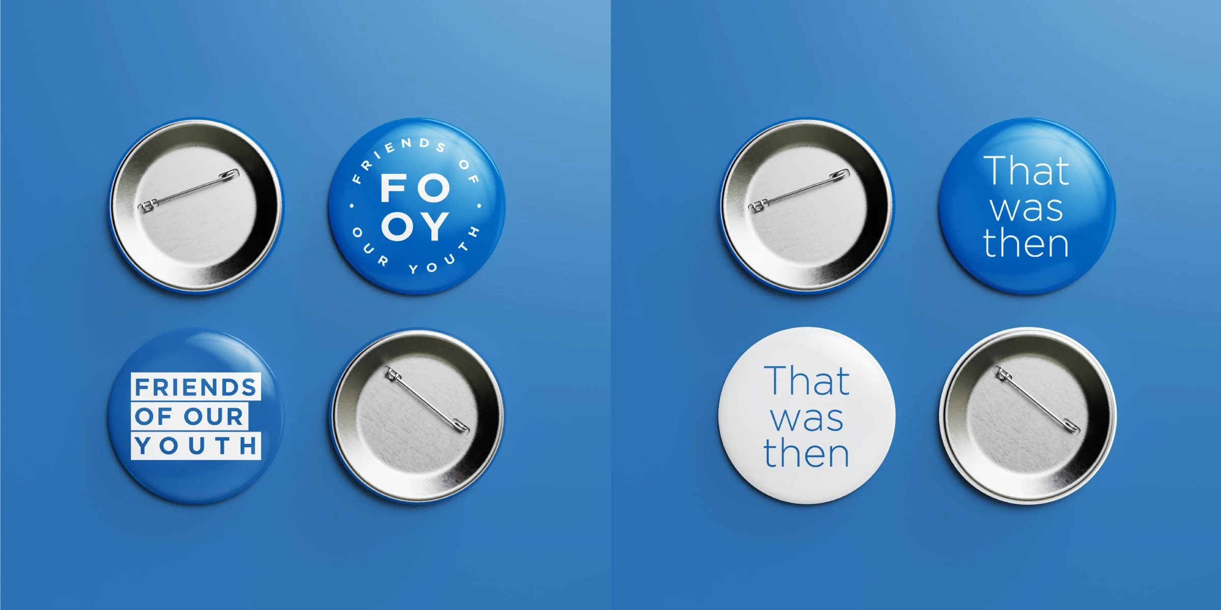
Friends Of Our Youth: Identity
The Problem: Develop a bold, simple, modernist identity for Todmorden / Manchester rock’n’roll band Friends Of Our Youth
The Solution: Being the writers of ‘daydreamers soundtracks’ I aimed to keep an enigmatic feel to the identity while also being able to keep things bold and emblematic. I developed a suite of logos that focused on typography, with nods to the work of Peter Saville and the Factory Records aesthetic. All these visual cues helped craft something timeless, while hopefully retaining a certain ‘Northern-ness’


